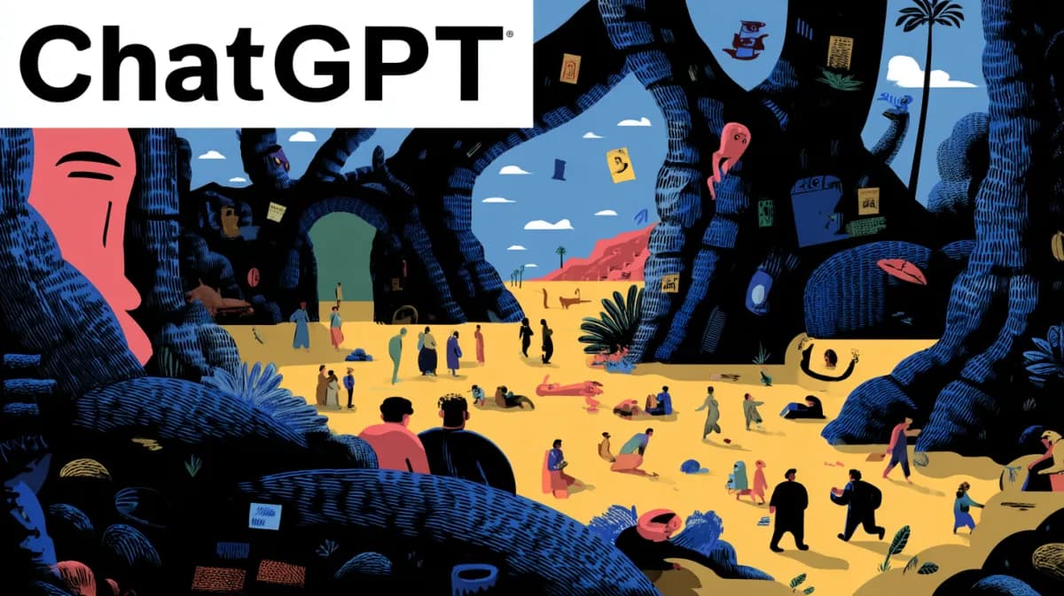
GPT Image 2 adds exploded views, faux covers and profile dioramas
GPT Image 2 is being used for magazine-style covers, game-interface scenes, exploded technical views and tiny 3D profile dioramas. Its strength in text-heavy, structured layouts is widening creative use cases, so watch fidelity and attribution closely.
TL;DR
- OpenAI's launch post framed GPT Image 2 as a higher-fidelity image model, but the creator evidence here shows a narrower, more interesting shift: CharaspowerAI's exploded-view post, underwoodxie96's faux-cover set, and AllaAisling's profile diorama all lean on structured layouts, readable labels, and stable composition.
- Faux editorial design is one of the clearest use cases so far, with underwoodxie96's faux-cover set, underwoodxie96's character card, and AIwithSynthia's ramen magazine layout all turning long prompt blocks into pages that already look halfway through art direction.
- The same layout control is spilling into pseudo-software and pseudo-games: underwoodxie96's sunscreen RPG screens, underwoodxie96's bedtime game scenes, and chrisfirst's Tony Hawk mock screenshot all use HUDs, quest text, and camera rules as core prompt ingredients.
- Storyboard-first video workflows keep showing up, because MayorKingAI's Apollo vs Ares thread and egeberkina's Berlin vlog thread both use GPT Image 2 to lock characters, shots, and continuity before handing motion off to Seedance or other video tools.
- According to the main HN thread and the HN discussion digest, the same realism and text fidelity that make these layouts useful are also driving the backlash around detectability, artist consent, and whether hard prompts still beat competing systems on raw image quality.
You can browse OpenAI's launch post, skim the main HN thread, and jump straight to the pricing/docs comment. There is also a weirdly practical pattern in the prompt-sharing culture itself: creators are publishing full-page prompt recipes for magazine covers, exploded diagrams, and game UI scenes, which makes GPT Image 2 feel less like a style model and more like a layout engine with a taste for fan art.
Magazine covers
The cleanest pattern in the evidence is fake publishing. Creators are not just asking for a portrait, they are asking for a full cover system: masthead, cover lines, issue metadata, barcode, pull quotes, and bilingual text blocks.
The recurring ingredients are easy to spot:
- A named publication format, like a gravure issue, lifestyle journal, or fashion cover.
- A fixed page architecture, including headline zones, sidebars, price marks, and captions.
- Specific typography instructions, often bilingual.
- One hero subject with enough visual consistency to support editorial packaging.
Artedeingenio put it bluntly: storyboards are becoming the new JSON prompts. In this batch, the same thing is happening to magazine art direction. underwoodxie96's character card and another underwoodxie96 cover set both read like design briefs more than image prompts.
Game interfaces
GPT Image 2 is also getting used to fake screenshots that obey game grammar. The image is doing character rendering, interface composition, quest copy, and camera placement at the same time.
Three prompt habits keep recurring here:
- Camera rules: chrisfirst's prompt explicitly locks the skater to a rear third-person gameplay angle and bans promo-style framing.
- UI inventories: underwoodxie96's RPG set and underwoodxie96's nighttime scenes specify quest logs, affinity meters, minimaps, button prompts, and dialogue boxes.
- World constraints: the beach resort, the Tony Hawk mall level, or a named district does a lot of work in keeping the scene readable.
That matters because older image workflows usually treated text and interface chrome as collateral damage. Here, the HUD is the point.
Storyboards and shot continuity
The more serious creator workflows in the evidence are using GPT Image 2 as pre-production, not final output. Images lock continuity, then video models animate the plan.
Two different methods show up.
- MayorKingAI's workflow builds character sheets first, then 3x2 storyboard sheets, then separate 15-second Seedance clips, then edits them together into a 30-second sequence.
- egeberkina's Berlin vlog starts with a 3x3 photo collage that fixes the subject's appearance, outfits, locations, and even vitiligo pattern continuity, then passes that collage into a video prompt that specifies handheld motion, autofocus hunting, rolling shutter, and dialogue beats.
The strong opinion here is simple: this is Christmas come early for people who already think in shot lists. AIwithSynthia's fitness storyboard collage and egeberkina's Berlin prompt block both show how much production planning can be packed into a single page before animation starts.
Exploded views
The most unexpectedly useful trick in this set is exploded technical art. CharaspowerAI's post shows GPT Image 2 separating a DeLorean, a Warthog, Ecto-1, and Kaneda's bike into clean floating assemblies with readable spacing.
That format only works if four things stay stable at once:
- Object identity
- Part hierarchy
- Spacing and alignment
- Labels or legible visual grouping
This is where the model starts to look less like a pure illustrator and more like a diagram generator. The HN conversation is relevant here too: the pricing/docs comment notes API docs and pricing changes, while the broader HN thread is full of people stress-testing text-heavy compositions for exactly this reason.
Profile dioramas
Another layout trick is the profile-as-object render. Instead of generating a banner or avatar, the prompt turns an entire social profile into a 3D scene with a miniature self standing in front of it.
The useful detail is that the model keeps multiple identity layers aligned at once:
- The creator's avatar or likeness
- The handle and profile metadata
- The pinned-post context
- A matching miniature character on a pedestal
That is close to product mockup territory. It is not just portrait generation, and it is not just UI generation. It is packaging a social identity into one promo-ready composition.
Typography and poster systems
Several examples push even harder into graphic design territory. CharaspowerAI's typographic portrait builds Michael Jordan out of words, AIwithSynthia's badminton poster assembles a branded sports collage, and AllaAisling's long-exposure prompt studio turns a reusable prompt shell into a template system.
The structure is the point:
- Typographic portrait, where text becomes the shading material.
- Multi-panel poster, where one subject has to survive across beauty, hero, and action frames.
- Prompt template, where placeholders like mood, subject, environment, and palette let the composition survive new inputs.
That is why the prompt-sharing links matter. These are not one-off flexes. They are getting packaged like reusable design macros.
The pushback is about realism, not only quality
The community discussion is not just about whether GPT Image 2 looks good. According to the HN discussion digest, commenters split between pricing/docs questions, head-to-head comparisons with Google's image systems, and concerns that the images are getting hard to identify as synthetic.
ChatGPT Images 2.0
For creatives, the thread is about whether the new image model is good enough for real artwork, comics, and text-heavy compositions. People are testing difficult prompts, comparing fidelity against competitors, and also worrying that the realism makes AI-generated images harder to detect and raises style-consent questions.
Three concrete objections surfaced there:
- minimaxir's cited HN comment focused on model-card and API pricing details.
- vunderba's cited HN comment argued Google's image models still had the edge on visual fidelity.
- overgard's cited HN comment worried that more realistic outputs make AI images harder to spot and deepen the artist-consent problem.
That last point is new information relative to the layout tricks above, and it changes how these workflows land. The same capability that makes a fake magazine cover convincing also makes attribution murkier when the page is built around recognizable characters, styles, or identities.