
Magnific shares six Ideogram 4.5 poster workflows
Magnific publishes six poster workflows made with Ideogram 4.5. Each starts with a base image without text, then uses edits to add collage, illustration or typography.
TL;DR
- Six Ideogram 4.5 poster workflows start with text-free images, then add design elements through two edits in Magnific's published thread.
- Typography can arrive in stages: the Dog Club prompt adds the oversized headline before the smaller event details.
- Ideogram 4.5 is available on all Magnific plans through desktop, web and MCP, according to the launch post.
The paper-collage house prompt asks for a title rotated 90 degrees and a circular stamp around a key icon. A sitcom production example uses the same editor to fix a character's shirt before regenerating a video clip.
Open Houses
Magnific has published a tidy little art-direction playbook: six vertical 2:3 bases, each developed through two prompt-based image edits. Every edit specifies what must remain unchanged, putting concrete constraints behind its pitch for preserving previous work.
- Base: A torn-paper house assembled from brick photography, mustard paper, a wooden window, a blue door and a vintage-map roof. No text or graphics.
- First edit: Add a grey chimney and graphite-pencil smoke while retaining the collage, tape, shadows and background.
- Second edit: Add forest-green typography: headlines, dates, an edge title, event details and a circular stamp.
Dog Club
This poster puts the headline in the first editing pass, leaving the event information for the second.
- Base: Five leashed dogs photographed at street level in a direct-flash style, confined to a horizontal band near the top of a grainy black poster.
- First edit: Add “DOG” and “CLUB” in enormous, off-white, ultra-heavy grotesk type beneath the photograph.
- Second edit: Add the society name, RSVP copy, location and time, organized with hairline rules and “[WHERE]” and “[WHEN]” labels.
Slow Fire
The ceramics direction combines simulated risograph printing with a tightly specified typographic grid.
- Base: A coral-red and pale-pink grid of halftone bowls and cups, surrounded by generous off-white margins.
- First edit: Draw a black-ink vase over the grid, with a crack and a smoke line extending beyond the block.
- Second edit: Add Swiss-grid typography and thin rules. “Slow” uses a huge grotesk sans serif; “Fire” switches to an italic serif.
On Air
The radio-festival poster reserves empty lilac space around its central photograph for later additions.
- Base: A tilted, bordered halftone photograph of a transistor radio on lilac paper.
- First edit: Add four collage accents:
- Second edit: Add festival information and the brush-painted “ON AIR” title, with “ON” slightly overlapping the radio photograph.
Still Here
The theatre poster's final prompt specifies how lettering should interact with the people, not just where it sits on the page.
- Base: Four older people in colorful tracksuits and swim caps on a pier, with open sky above them and a Kodak Gold 200 photographic look.
- First edit: Add sparse white and pale-pink crayon doodles while leaving most of the upper sky clear.
- Second edit: Fill the sky with lime-green “STILL HERE” brush lettering, partly behind the raised hands. Add condensed white production credits and dates below.
Salt and Swell
The film-poster prompt separates the main title, tagline and billing block into distinct typographic treatments.
- Base: An overhead view of a lone swimmer in dark water at golden hour, with a Portra 800 look, grain, vignetting and a warm light leak.
- First edit: Add irregular off-white chalk rings around the swimmer and a hand-drawn sun.
- Second edit: Add coral-red “SALT&SWELL,” an off-white tagline and a condensed billing block. The prompt explicitly makes names larger than roles.
Sitcom reference sheets
For its We Need to Talk demo, Magnific also used Ideogram 4.5 to generate starting images, then invited users to create their own scenes. The production assets establish a handmade papier-mache look across characters and locations.
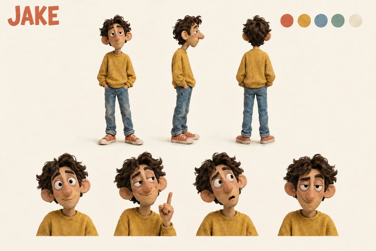
- Characters: The character sheets specify front, profile and back views, plus four expressive portraits and matching color swatches.
- Apartment: The set prompt requests one wide view above three detail panels: the sofa, laundry-covered chair and kitchen, with consistent furniture and colors.
- Credits: The title-card prompt assigns reference image 1 to typography and mood only, while references 2, 3 and 4 supply Ben, Chloe and Jake respectively.
Frame repair
A video model changed Ben's T-shirt, so Magnific repaired a still and used it to regenerate the clip.
- Extract the incorrect frame.
- Edit only Ben, restoring his stockier build and three flat printed shapes: a yellow circle, a teal triangle and a short navy bar.
- Regenerate the clip using the corrected frame as a reference.
The correction prompt protects his face, pose and height, along with the other characters, furniture, lighting and camera framing. It also prohibits cropping or recomposition.
Editable brand animation
In a separate workflow, creator ai_artworkgen described giving an agent PRMPT's brand rules and image archive. Tesseract by Mirage turned that material into a design system with three animated outputs:
- Spinning image worlds.
- Kinetic typography.
- Animated tokens.
The creator said every layer remained editable.
Tesseract brand animation with editable layers
Magnific access
Magnific offers Ideogram 4.5 across all plans on desktop, web and MCP; the poster thread links to the editor. Its platform page says desktop shares the same account, credits and tools, while MCP and API usage also runs on plan credits.
Typography quirks
Runware documents errors in its own examples in its Ideogram 4.5 design guide:
- A narrow juice-bottle label wrapped the flavor line and lost a separator.
- A pricing layout added an unrequested “Choose your plan” heading and a subline.
- An Arabic sale banner rendered a different discount number from the requested 50.
- A Japanese promotional poster added a “NEW” burst that was absent from the prompt.